Tuesday, October 28, 2014

11- Short Depth of Field

Camera Lens/ Aperture

Aperture is the opening of your lens. The aperture opens and closes to allow more or less light in to your camera; it effects the amount of light that is allowed into your frame. It also effects how much of the frame is in focus. Aperture is defined by f/stops; the smaller the f/stop number (f/2.8), the larger the opening.

Depth of Field
Is the amount of the image that is in focus.

Three Things that Control Depth of Field
1. The Aperture: The larger the opening, the more light can get in, and the more blurry the background or foreground will be.
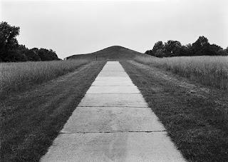
2. The Size of the Lens: Shorter the lens, the more that will be in focus.
3. Distance to Subject: The closer to the subject, the less amount in focus.

How to Set your Camera to Shoot Short Depth of Field only:
Set your camera to Aperture priority mode (it’s usually indicated by a capital “A” or an “Av.”). Find a scene that you want to photograph, then set the f/stop to the lowest number that your lens can go. This will help to create a shallow depth of field. Your depth of field will be even more shallow if you are closer to the subject that you are focusing on.

[To create a long depth of field then set it to the highest setting. This will extend your focus further into your frame.]

ASSIGNMENT- Short Depth of Field Only:
Use a short depth of field for the whole roll. Select compositions that only work with short depth of field. Use a 50mm (normal) lens. Try the lowest aperture setting on your camera that will allow you to shoot (depends on lighting). Get close to your subject. Shoot a full roll 25-40 all using short depth of field. Create a contact sheet of 25-40 short depth of field images, save your best 3 to your blog and to the share folder.

Advanced Photo Students: try a few using the "BOKEH" effect
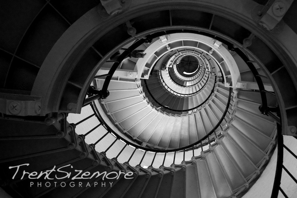
Bokeh comes from the Japanese word boke (ボケ), which means "blur" or "haze", or boke-aji, the "blur quality." Bokeh is pronounced BOH-Kə or BOH-kay. Bokeh is defined as “the effect of a soft out-of-focus background that you get when shooting a subject, using a fast lens, at the widest aperture, such as f/2.8 or wider.” Simply put, bokeh is the pleasing or aesthetic quality of out-of-focus blur in a photograph.
To increase the likelihood of visible bokeh in your photographs, increase the distance between your subject and the background. You can do this by decreasing the distance between the camera and subject. The more shallow the depth-of-field, or further the background is, the more out-of-focus it will be. Highlights hitting the background will show more visible bokeh too, so if you’re using a backlight, side light or a hair light, the bokeh may be more pleasing to the eye. Usually when there is low lighting with small light sources.

12 Pattern & Rhythm

 
Pattern
Pattern is another great principle to incorporate into your photography. You can create a pattern with any kind of repeated shape. These repeated photographic elements will create a type of unity and structure to your photography. By finding a pattern in lines,shapes, or colors you can easily add rhythm to your photographs that the human eye will easily follow.
 
Rhythm
When motifs or elements are repeated, alternated, or otherwise arranged, the intervals between them or how they overlap can create rhythm and a sense of movement. In visual rhythm, design motifs become the beats. Rhythms can be broadly categorized as random, regular, alternating, flowing, and progressive.
Random Rhythm - Groupings of similar motifs or elements that repeat with no regularity create a random rhythm. Pebble beaches, the fall of snow, fields of clover, herds of cattle, and traffic jams all demonstrate random rhythms. What may seem random at one scale, however, may exhibit purpose and order at another scale.
Regular Rhythm - Like a heart or song with a steady beat, regular rhythm is created by a series of elements, often identical or similar, that are placed at regular or similar intervals, such as in grids. Simple regular rhythms, if overused, can be monotonous.

Assignment- Take a roll (30-40 digital) concentrating completely on "Patterns & Rhythm" in your frame. Topic is up to you. Make a contact sheet, save to the share folder and paste your best in your journal/blog.

Wednesday, October 22, 2014

12- Principle of Design- REPETITION

REPETITIONThe principle of repetition is the reusing of the same or similar elements throughout a design. Repetition of certain design elements in a design will bring a clear sense of unity, consistency, and cohesiveness o multiples.

REPETITION is the use of similar or connected pictorial elements- similar shapes, colours or lines that are used more than once

REPETITION can be regular or irregular, even or uneven.

REPETITION can be in the form of RADIATION where the repeated elements spread out from a central point.

REPETITION may be in the form of GRADATION where the repeated elements slowly become smaller or larger.

REPETITION works with pattern to make the artwork seem active. The repetition of elements of design creates unity within the artwork.

Compose 30-40 photographs concentrating on REPETITION as your design focus. Download, create a contact sheet of 30-40 images and post your best image to your journal/blog.

Tuesday, October 21, 2014

12-Movement

Definition of Movement: is the path the viewer’s eye takes through the artwork, often to a focal area. It can be directed along lines, edges, shapes and color. Movement is closely tied to rhythm. Your eye moves through this image, because the lines are spiral you through to the core. The contrast between the light and the background make the light areas and the lines stick out. 

Assignment- Take a roll (30-40 digital or BW) concentrating completely on "Movement" in your frame. Topic is up to you. Make a contact sheet and paste your best in your journal.


Monday, October 20, 2014

12-Balance

https://blogger.googleusercontent.com/img/b/R29vZ2xl/AVvXsEhJ3E6nfc5uem88O7yM4yaux_tTDUz-tNIbDvQ2kXNecDBtNYQaakkc5gEDTGGR7d4S6KCeZcXteoYfmNYo6Txr6shwo529ls2KQtSYYy7ngFOrcgpy3mghjcaXRUbRQWu5bASuqbm1PF4Q/s1600/801942290_cac9b49f77.jpg Balance is a photography technique that involves capturing images within a frame so all parts of the image have equal visual weight. Proper balance should increase the visual appeal of a photograph. There are generally two types of balance, formal and informal.
Formal balance is symmetrical balance. To achieve this type of balance, the focus of the picture should be placed in the middle of the image, while identical or similar subjects are evenly spaced around the central point. Portraits are an example of a picture where it is best to use formal balance.
Informal balance is more indistinct in nature. In a photograph with informal balance, dissimilar elements balance each other out on either side of the frame. Informal balance can occur with objects of any size, but it is most visually appealing to have a larger object balanced out with a smaller object or several smaller objects. This type of balance usually follows the rule of thirds.
Other ways to informally balance photos include having a small area of white against a large area of black, or black against white. This principle also works with vibrant colors against neutral colors. A small area of highly textured material can also balance out an area with little texture.
Assignment- Take a roll (30-40 digital or BW) concentrating completely on "Balancing" your frame. Either Symmetrical or Asymmetrical Balance. Topic is up to you. Make a contact sheet and paste your best in your journal.


Thursday, October 16, 2014

White Balance


White Balance (WB) is the process of removing unrealistic color casts, so that objects which appear white in person are rendered white in your photo. Proper camera white balance has to take into account the "color temperature" of a light source, which refers to the relative warmth or coolness of white light. Our eyes are very good at judging what is white under different light sources, but digital cameras often have great difficulty with auto white balance (AWB) — and can create unsightly blue, orange, or even green color casts. Understanding digital white balance can help you avoid these color casts, thereby improving your photos under a wider range of lighting conditions.


For this technical assignment:
Try all of the Auto White Balance settings on your camera while photographing the exact same scenarios. Don't move a hair. Stay in the exact same place only change the WB on your camera (finish with custom WB). Try three different set ups in three different kinds of lighting i.e. outside/daylight, interior/fluorescent, interior/incandescent. Make a contact sheet of your different experiments 24 + photos and post one of the scenes in your journal/blog (8 photos with WBs labelled).

How to Set Custom White Balance:
1) Hold/Place your 18% Grey Card in the desired lighting & take a photo of it. Ensure you cover the entire frame with the Grey card & expose properly(the exposure meter should be balanced in middle i.e. 0 in your viewfinder).


2) Navigate to the second tab(Shooting Tab 2) under MENU on your Canon EOS DSLR. Select ‘Custom White Balance’. It will now open up the saved images on your memory card & prompt you to select one. Select the one of the Grey card you shot in step #1 above. It will ask you to use White Balance data from this image for custom white balance. Select Ok.

3) Now change the White Balance to ‘Custom’ from MENU & proceed to take your photograph. The photograph should have accurate colours.

Handy tips when using Custom White Balance:
* Once you’ve set a custom white balance for a particular light type (tube-light, bulbs etc), there is no need to set the white balance using grey card again. You only need to redo the above procedure if you happen to change the lighting setup. Remember, once you setup your custom white balance in your camera & start shooting, do NOT change the light setup. Or you’ll be plagued with improper white balance.
* It doesn’t matter if you shoot the Grey card shot in RAW or JPEG for setting Custom White Balance.
* While shooting the Grey card, using spot metering is recommended if you’re not able to get close to fill the entire frame with the Grey card.
* If you don’t have a Grey card, you can use almost any neutral grey surface to set the white balance (some use a white sheet of paper, but some white is not true white). If the surface is not totally neutral, you may need to make fine adjustments to your white balance later on computer in-spite of using a custom white balance.


Here is the difference between Auto White Balance & Custom White Balance. Notice the shifts in black. The entire image had a blue-ish tinge to it when shot in AWB. Even the wooden surface did not exhibit any wood like appearance. I set a ‘Custom White Balance’ & voila! The natural colours are back. Both the shots were taken at Standard Picture Style in Canon EOS DSLR & were unedited for this demonstration.
Now your task is to try setting custom white balance, taking a picture & then taking the same picture using Auto White Balance. Compare the results from both on your computer’s monitor & see the difference. I bet, you’ll become a follower of Custom White Balance.
Setting Custom White Balance
White Balance

Monday, October 6, 2014

12 Excess [Principles of Design]

Contrast
Movement
Balance
Unity and Harmony
Rhythm
Balance
Balance, Contrast, Emphasis, Harmony & Unity, Movement, Pattern, Repetition, Rhythm

Repetition
ex·cess
noun: excess; plural noun: excesses
1.      an amount of something that is more than necessary, permitted, or desirable.
"are you suffering from an excess of stress in your life?"

Principles of Design
Balance, Contrast/Emphasis, Movement, Pattern, Repetition, Rhythm, Unity/Harmony.

Photograph a simple subject with a variety of backgrounds, angles, lighting and distances using principles of design.

What to do………………………………………………
Excess- a simple concept packed with potential symbolism and cultural connotations. Construct and design frames using the concept “excess” using different principles of design scenarios each time. Use the Principles of Design definitions from your work sheet as your guide and try a least one of each principal. Really push the boundaries, meaning, and visual concept.

Be creative, using digital photography. Make 2 + contact sheets, seven- 5 x 7 working prints (one of each principle), and one 8 x 10 print of your best for your portfolio. Post best images on and in your blog/journal. We will have a critique on the due date.

Evaluation………………………………………………Each print will be out of 5 marks, part marks will be awarded for the following:
1 composition with clear use of design principles, 2 technical exposure and appropriate use of depth of field and shutter speed, 3 darkroom/Photoshop proficiency (not too much contrast, not too little), 4 originality, and 5 professional presentation.
Journal 7 found examples of Principles               7
2 Digital Contact Sheets                                      10
7- 5 x 7 prints (5 marks each)                            35
Final 8 x 10                                                            5
Total                                                          57

11 Apple- Composition Techniques

Framing
 Photographic Emphasis Techniques
Explore composition and visual story telling in Photography. Identify effective compositional techniques used to tell a visual story. Find the following emphasis techniques and define in your journal:
  1. Leading Lines
  2. Repetition
  3. Rule of Thirds
  4. Contrast
  5. Framing

Then take an apple and photograph it. Create compositions using the above techniques to emphasize. 


Project Outline:
Photograph a simple subject with a variety of backgrounds, angles, lighting and distances while concentrating on storytelling through composition techniques: contrast, framing, leading lines, repetition, rule of thirds.

Apple- a simple subject packed with potential symbolism and cultural connotations. You are to take your apple and your camera everywhere. Explore a variety of backgrounds and experiment with different emphasis composition techniques to construct and design frames to organize your apple.

What to do……………………………………………………
Take 35-40 digital photos of your apple in a variety of scenarios. Make a contact sheet. Then post/paste your top 5 images working prints to your blog/journal; there will be questions to respond to Print one 5 x 7 of your best. We will have a critique on the due date…

Evaluation……………………………………………………. 
Contact Sheet
Each print will be out of 4 marks, part marks will be awarded for the following:
·   Composition with clear use of emphasis technique.
·   Technical exposure/focus.
·   Originality storytelling. Creative
·   Professional presentation images are labelled and saved to the share file.
Found example of emphasis technique              5
Digital Contact Sheets are out of                        5
5 images posted to blog/journal     4 each=     20
Questions/Critique                                             10
Final 5 x 7 Print                                                     5
Total                                                        45


Thursday, October 2, 2014

Elements of Design

Today we are going to download and make a contact sheet of your elements of design photo explorations from last class' field trip. I will review how to do this for you. Title each image with the element you photographed (if you have more than one of each element, you will have to number them). You should have at least one example of each element: line, shape, form, texture, colour/contrast and a few combinations.

Save your contact sheet to the class sharing site and then post your top 5 Elements photos to your blog. If you have time,you can upload your selfie and take a few moments to personalize your blog.

Also save your top 5 to the share for a class slide show after for a class critique, make sure to label with your name and the element.