Monday, December 2, 2013

11 Shutter

The Shutter

The shutter is like a door, it opens and closes to let light into the camera to expose the film, or sensor to light for a set time. Shutter speed is measured in seconds – or in most cases fractions of seconds. The bigger the denominator the faster the speed (ie 1/1000 is much faster than 1/30).

Shutter Speeds:
1  2  4  8  15  30  60  125  250  500  1000  2000  4000
The lower the number, the slower the shutter speed, the greater amount of light and blur.
The higher the number, the faster the shutter speed, lesser amount of light and blur.

B-Bulb: When you press the Shutter, it opens for as long as you keep your finger on the shutter button
T-Time: When you press the Shutter button, it stay open until you press it again (not common on newer cameras).
Guess what shutter speed was used for the following photos:


Painting with Light

Photo 11s- More Photo Vocabulary, The Shutter

Define the following , explain the function of the setting, add in your journal:

  1. SLR-
  2. TLR-
  3. Shutter-
  4. Shutter Speeds-
  5. Bulb-
  6. Cable Release-
  7. Tripod-
  8. Light Meter-
  9. Bracketing-
  10. Hot Shoe-
Find image examples of the following for your journal:
  1. Slow Shutter Speed,
  2. Fast Shutter Speed,
  3. Panning,
  4. Painting with Light,
  5. Multiple Exposures,
Up next, Painting with Light. Watch the following:
Willowz Jubilee
Painting with Light
Cool Light
Stupid Gratuitous Violence, but Cool

Tuesday, November 19, 2013

Aperture & Depth of Field


Depth of Field Site
Digital Photo School
iStock Photo
Define the following, put in your journal:
  1. List Standard Aperture/F-stops from brightest exposure to darkest-
  2. Aperture Priority-
  3. Ambient Light-
  4. Artificial Light-
  5. ASA/ISO/Film Speed-
  6. Bracket-
  7. Depth of Field-
  8. Exposure Triangle-
  9. How to Control Depth of Field-
  10. Light Meter- 
Find examples for your journal label each image and guess the aperture settings used on the camera.
Short, Medium, Long Depth of Field.

Let's try these together...


Monday, November 18, 2013

Micro, Macro & Close-up

The word macro means big, whereas the word micro mean small. So how is it that these two terms related? If the subject you are photographing is small and you want to make it look big, you end up with a “macro” view of a “micro” subject.


What is macro (micro) photography?
Macro photography is that which is taken with a dedicated macro lens. A real macro lens has the capability of achieving in the least a 1:1 magnification. Just because a camera has the word macro written on it, doesn’t make it a true macro lens. Both the Nikon and Canon lenses mentioned above, are considered real macro lenses. If you’re not sure how to recognise a real macro lens, you may find an earlier article useful called, What is a real macro lens.

What is close up photography?
Close up photography, is the act of photographing objects such as flowers or insects in close range so the subject you are photographing fills the frame. In other words, it’s the act of photographing subjects close up. This is easily achievable with any lens, even a 300mm telephoto lens.
Macro photography is in essence close up photography as well. However, close up photography is not always considered as true macro photography. For example, if you have a lens that is NOT considered a real macro lens, yet offers a macro setting (as many do nowadays), this is usually refered to as being close up photography, and not true macro.

Monday, November 4, 2013

Histograms

A histogram is a simple graph that displays where all of the brightness levels contained in the scene are found, from the darkest to the brightest. These values are arrayed across the bottom of the graph from left (darkest) to right (brightest). The vertical axis (the height of points on the graph) shows how much of the image is found at any particular brightness level. Possibly the most useful tool available in digital photography is the histogram. It could also well be the least understood. In this article we will look at what a camera histogram tells the photographer and how best to utilize that information.

Virtually every digital camera, from the simplest point-and-shoot to the most sophisticated digital SLR has the ability to display a histogram directly, or more usually superimposed upon the image just taken.

This histogram shows an almost perfect distribution of tones covering about a 4 stop dynamic range — from deep shadows on the left to just short of bright highlights on the right. This fits comfortably within the approximately 5 stop dynamic range capability of most digital imaging chips.
A light meter reading tells you what exposure will render a standard 18% gray reference card as a mid tone. This reading may have been made because the camera read a variety of areas of the scene and averaged them out, or because you read the highlights, the shadows and some other areas and decided that a particular setting would yield the best compromise exposure for that scene.
This setting, like every other that you or your automated camera makes, is a compromise. In most real world situations there is no such thing as an ideal or “perfect” exposure. There is simply one that places the tonal values found in the scene most appropriately within the capability range of the camera’s imaging chip. And "most appropriately" means that the mid-tones found in the image fall roughly half way between the darkest and the brightest values. Hold that thought while we digress for a moment and look at the concept of dynamic range.

if a part of the image receives too much light it becomes burned out, and if too little light it is rendered as black. A recognizable image is only recorded if the light hitting the chip falls within a range of about 5 F stops. (Remember — each F stop is a doubling or halving of the amount of light hitting the film). With digital things are much the same and even the dynamic range is about the same as for slide film; about 5 stops. Also keep in mind that the total range of brightness values encountered in the real world is only about 10 stops — from the dimmest light that you can read in to the brightest beach or snow scene in which you might find yourself).

Histograms

Making a Contact Sheet


We are going to learn how to use Adobe Bridge to select, rename and organize your photos into a contact sheet. Bridge has many functions such as batch rename and other utilities to help with organization, and supports editing of digital images in Camera Raw format. Organizational features include assigning colored labels or star ratings to images. And can recognize a variety of file types. Here is a tutorial to clarify: http://youtu.be/6m9nBwiskAQ you only need to watch the first 2:20 mins. Don't change the spacing and keep "file name" turned on.
  1. Open Adobe Bridge
  2. Open the file that holds your Emphasis/Rules photo.
  3. Right click RENAME the photos by the emphasis technique you used.
  4. CTRL click on the photos using the same emphasis technique
  5. Select "OUTPUT" under the top tool bar.

  6. Go to the Output window on the right of your screen (sometimes it will take a minute to appear).
  7. Select PDF instead of WEB GALLERY.
  8. Under the TEMPLATE option, select CONTACT SHEET (4*5=20 photos or 5*7=35 photos)
  9. Scroll to the very bottom of the Output window to where it says SAVE.
  10. Before you press save, check the "VIEW PDF AFTER SAVE"
  11. Once the PDF opens, FILE>SAVE AS>
  12. Type the assignment name i.e "My LFAS2 Contact Sheet" or "Emphasis Contact".
  13. SAVE AS TYPE: Select "JPG"
  14. Make sure you select where you are going to save it to.
  15. Then press SAVE.
  16. Post to your blog as you would post an image.

Sunday, September 15, 2013

11 Camera


Camera Terms
Define the following in your journal, explain what the setting does:

M (Manual)-
Av (Aperture Priority)-
S or Tv (Shutter Priority)-
P (Program)-
Auto-
Face/Portrait Mode-
Mountain/Landscape Mode-
Runner/SportsAction Mode-
Flower/Still Life Mode-


Photography Terms
Define the following and find photo examples for your journal:

Ambient Light-
Artificial Light-
ASA/ISO(film sensitivity)-
Depth of Field-
Exposure-
Exposure Triangle-
F-Stop-
Panning-
Slow Shutter-

Monday, September 9, 2013

Instagram Assignment

Today we are to go out to take photos with our personal electronic devices- cell phone, ipod, anything with a camera to take a collection of photos based on the following inspiration:
  1. Something about me
  2. What I am curious about
  3. Portrait of LFAS
Take several photos for each topic with your phone camera.
Choose your favourite photo and upload it to the class Instagram site:
Login: photo1112e
Password: lfas1234


Type your name in the comment line and/or hashtag your name
and hashtag the #topic.

Tuesday, May 21, 2013

High/Low Studio Lighting

Low-Key Lighting
Low-key lighting is a style of lighting for photography, film or television. It is a necessary element in creating a chiaroscuro effect. Traditional photographic lighting, three-point lighting uses a key light, a fill light, and a back light for illumination. Low-key lighting often uses only one key light, optionally controlled with a fill light or a simple reflector.
Low key light accentuates the contours of an object by throwing areas into shade while a fill light or reflector may illuminate the shadow areas to control contrast. The relative strength of key-to-fill, known as the lighting ratio, can be measured using a light meter. Low key lighting has a higher lighting ratio, e.g. 8:1, than high key lighting, which can approach 1:1.
The term "low key" is used in cinematography to refer to any scene with a high lighting ratio, especially if there is a predominance of shadowy areas. It tends to heighten the sense of alienation felt by the viewer, hence is commonly used in film noir and horror genres.
Low-Key Tutorial 1
Low-Key Tutorial 2

High-Key Lighting
High-key lighting is a style of lighting for film, television, or photography that aims to reduce the lighting ratio present in the scene. This was originally done partly for technological reasons, since early film and television did not deal well with high contrast ratios, but now is used to suggest an upbeat mood. It is often used in sitcoms and comedies. High-key lighting is usually quite homogeneous and free from dark shadows. The terminology comes from the key light (main light).

In the 1950s and 1960s, high-key lighting was achieved through multiple light sources lighting a scene—usually using three fixtures per person (left, right, and central) —which resulted in a uniform lighting pattern with very little modeling. Nowadays, multiple hot light sources are substituted by much more efficient fluorescent soft lights which provide a similar effect.

High-Key Lighting Tutorial 
Project Criteria

Tuesday, April 30, 2013

11 Colour CD Project


Rolling Stones-Goat Head Soup
Photo Series: Take a series of high contrast B/W photos for a CD cover inspired by music. Your images should be distinctly inspired by a musical genre or style of music. The music is up to you- could be a remake of an already existing CD for your favourite band, or a CD cover for an independent band, or for an imaginary band. Your series will be photographed with black & white film, but printed monochromatically using the colour printer.

Part 1- Planning
Select your music and plan out how you are going to represent it visually. Select 6 songs to inspire your CD cover. Either choose one song for each of the images, or make a booklet representing the overall style of music.

Journal:
  1. 3 Examples of CD covers
  2. Elements of Design- Find one photo for each element of design line, shape, texture, form, colour.  or Principles of Design- rhythm, repetition, balance, contrast, pattern, movement.   
  3. Colour Wheel of Photos- Organize a series of photos n a sequence relating to the colour wheel. see colour wheel below.
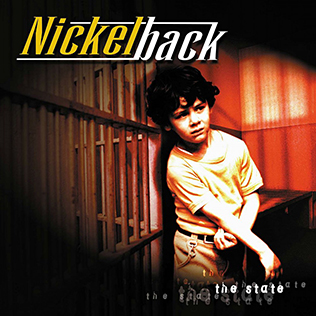
Nickelbac- the state

Part 2  Photographing 3 Elements of Design: Line, Shape, and Texture. You can also explore the Principles of Design: rhythm, repetition, balance, contrast, pattern, movement in your compositions.
Each of your images should purposefully include at least one of the Elements of Design, and/or Principle of Design in each photo. Consider contrast when selecting your elements 
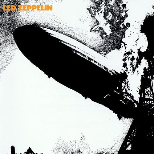
Led Zeppelin- One
Part 3 Develop Negatives with High Contrast: Develop your negatives 1- 2 minutes longer to create high contrast. Then print a BW contact sheet, make sure you have included all of the elements of design.
Cold Play- Parachutes
Part 4
Colour Darkroom: Print three 5 x 5 prints (red, blue, and yellow, OR green, orange, purple). They are square to fit the proportions of a CD cover, so consider the format when you are shooting, you will have to crop off part of your photo. You are to print your photos on colour paper with the colour processor. You are to use colour filters to create mono-chromatic (one colour) colour. Remember that the colour on the enlarger will make the opposite effect on your print. For example, adding a yellow filter creates a purple print.
Celine Dion- Celine

Sunday, April 21, 2013

12 Mini Concentration

For the purpose of this assignment, you are to work with one assigned concept and define it visually through the photographic process. In the end, you should not only have an interesting solution to the concept definition, but have created a series as well. What is a series? A picture series is a group of images related by some aspect held in common (ex. a certain mood, subject matter, technique, function or purpose). It is easy to understand a photographic series by looking at picture stories produced by photojournalists. The viewer gains an understanding of the story by the cumulative effect, not necessarily by the order in which the pictures are presented. This assignment begins with a concept. It is your task to define the concept visually and develop it into an interesting “series” of images. Develop a series of images that are thoughtful and meaningful over the entire term. Try 3 different mediums to experiment with your concentration idea.

11 Monochromatic Photography

Monochrome is defined as an object or image is whose range of color consists of shades of a single color or hue. This type of artistic work is often described to be a painting, drawing, design, or photograph in one color or shades of one colour. Images using only shades of grey (with or without black and/or white) are called grayscale or black-and-white. It may also be used to refer to other combinations containing only tones of a single color, such as green-and-white or green-and-black. For your Monochromatic CD cover project, first listen to music and let sound inspire you, write down ideas you have that can be transferred visually. Then take a series of images on B/W film that represent the music. Develop the film 1.5 - 2 mins longer than normal. And/or shoot in bright sunlight to achieve high contrasted images. Print a contact sheet in B/W and then 6 5 x 5 images on 5 x 8 paper. ***Before you start this project, try a test 5 x 8 print using B/W film using a colour filter.*** monochrome example

Tuesday, February 26, 2013

Toning and Tinting - Grade 11

3 images to be completed for this assignment:

1.  One fully toned image:  Sepia or Blue tone.  Your choice.
2.  One masked image using rubber cement to mask out your selection.
3.  One hand tinted image.

A funny but useful hand-tinting youtube video HERE

Just in case you are wondering...

REASONS for TONING:

  1. AESTHETIC EFFECT AND CREATING MOOD:  toning changes the appearance of the image and helps to create a certain atmosphere the artist wishes to convey.  Portraits, landscapes and sunsets benefit from warmer tones like sepia.  Snow scenes, sea scapes, night views, mechanical images suit the use of blue toners.
  2. ADDITIONAL PROTECTION:  Some toners convert or coat the silver image giving it greater resistance to damage from external contaminants.
  3. INCREASED MAXIMUM DENSITY:  Some toners increase print density (blue and selenium)
  4. DIFFERENT OVERALL PRINT COLOUR:  Dilute toning baths alter the colour of a print appealing to personal taste.


Monday, February 18, 2013

Sharkwater & Oceans

Rob Stewart, photographer, oceanographer, videographer, author, diver will be visiting LFAS on Friday, March 1st @ 7pm ($15). His feature documentary film Sharkwater will be presented in the Chief Sepass Theatre on Friday February 22nd also at 7pm ($1 minimum donation). In class, we will be watching Sharkwater and exploring various aspects of the ocean to gain a better understanding of the underwater world before he arrives.

Questions about Sharkwater:
  1. What are some myths and misconceptions about sharks?
  2. What is the problem with this?
TEDtalks: Brian Skerry "Reveals ocean's glory and horror"

  1. Identify one other BIG issue/concern that is presented in Sharkwater or Brian Skerry's Ted Talk.
  2. How can we (society) help/solve this problem/issue?
  3. How will you help solve this problem issue? 
  4. Think of a question you can ask Rob Stewart when he comes to LFAS.

  1. Watch one of the following TEDtalks about the ocean, or a documentary about the ocean and write a short summery about the information that was presented.
  2. Identify the main concern(s).
  3. List some of the sollutions that you learned, or think of some of your own.
TEDtalks: Mike deGruy "Hooked by an octopus"
TEDtalks: Jeremy Jackson "How we wrecked the ocean"
TEDtalks: Sylvia Earle "To protect our oceans"
TEDtalks: Capt. Charles Moore "On the seas of plastic"
TEDtalks: Simon Berrow "How do you save a shark you know nothing about"

Sunday, February 3, 2013

12s Wrecking Film

Alternative Film Developing Processes-> Creating Mood in Photography
Scratching Negatives
Caffenol Developing

Expired Film
Red Scale


Reticulation

Cross Processing

Some other techniques-
  • Dip or Spaghetti Film Developing
  • Homemade Developer ie. Caffinol
  • Chrome w/ BW
  • Red Scale
  • Scratching, Burning, Mangling Negatives
  • Over/Under Exposing
Research 3 alternative film processes, define, explain what they are and how to do it, gather photo examples for your journal and try one or more for a random roll, print a contact sheet and at least one print for your journal.

Monday, January 14, 2013

Photoshop Tutorials

Try 3 Photoshop Tutorials from the booklet provided Save As another document name into new folder:
  1. Painted in Image
  2. Burnt Edges
  3. Traced Edges

Monday, January 7, 2013

2012 Year in Photos

Happy New Year Everyone!
For our first day back to school after the winter break, we are going to reflect on the past year through photographs that marked  significant events. There are a few sites that host selections of photos from the year. We are going to look at a few with the class and then you can explore on your own to find photos that you find important to you either something that you remember, or perhaps images that inspire change:

MSNBC.com
Reuters.com 
TIME Magazine
TIME 366
MSNBC- New Years Traditions
NYTimes- The Lens

View images from the sites provided of 2012. You are to select 2 impactful images from 2012 and add them to your journal/blog. In your own words, write a reflection to explain the event that the image is representing and why you chose it to represent the year.